Overview

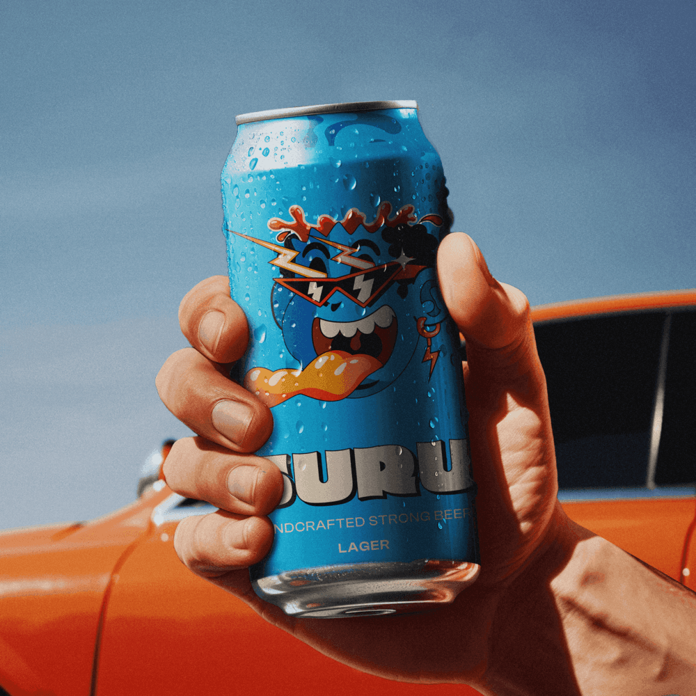
Suru, an esteemed beer brand with a decade-long legacy, partnered with Stroffe to refine its brand identity and elevate its presence in the market. Despite its loyal customer base, Suru aimed to rejuvenate its image to better resonate with modern consumers seeking both quality and a compelling brand experience.

CLIENT

Suru

YEAR

2023

DELIVERABLES

Brand Book, Brand Guidelines, Packaging Design, Pitch Deck, Social Media templates

ROLE

Brand Strategist, Creative Direction , Packaging Designer, Visual Conceptualization

The Problem

Ten years in. Time to look the part.

Suru had earned its loyal following. A decade of craft brewing, no preservatives, a product people genuinely loved. But the brand they'd built around that product didn't reflect the quality inside the bottle. The visual identity lacked the sophistication to compete on shelf, and the story — the spirit of fun, adventure, and authenticity that Suru was actually about — wasn't coming through anywhere. In a crowded market, a beer that looks generic gets treated as generic. Suru needed a brand that could finally match what it had always been.

Project image 01

The Brand Strategy

Craft the outside to match the inside

Every brand touchpoint was developed and refined through an iterative review process — from logo and typography through to packaging design that could hold its own at retail. Premium craftsmanship was emphasized throughout, because packaging is the first thing a new customer judges. The result was a brand system that didn't just look better — it gave Suru a story worth telling.

Every brand touchpoint was developed and refined through an iterative review process — from logo and typography through to packaging design that could hold its own at retail. Premium craftsmanship was emphasized throughout, because packaging is the first thing a new customer judges. The result was a brand system that didn't just look better — it gave Suru a story worth telling.

The Execution

From identity to shelf

Every brand touchpoint was developed and refined through an iterative review process — from logo and typography through to packaging design that could hold its own at retail. Premium craftsmanship was emphasized throughout, because packaging is the first thing a new customer judges. The result was a brand system that didn't just look better — it gave Suru a story worth telling.

Every brand touchpoint was developed and refined through an iterative review process — from logo and typography through to packaging design that could hold its own at retail. Premium craftsmanship was emphasized throughout, because packaging is the first thing a new customer judges. The result was a brand system that didn't just look better — it gave Suru a story worth telling.

The Result

What Changed

Before: A beloved product with a brand that couldn't communicate its own quality. After: A contemporary, visually striking identity that earns shelf presence and creates an emotional connection with modern consumers. Increased perceived value and shelf appeal through premium packaging design Clear competitive differentiation from other players in the craft beer space Enhanced consumer engagement through a brand narrative that resonates

Before: A beloved product with a brand that couldn't communicate its own quality. After: A contemporary, visually striking identity that earns shelf presence and creates an emotional connection with modern consumers. Increased perceived value and shelf appeal through premium packaging design Clear competitive differentiation from other players in the craft beer space Enhanced consumer engagement through a brand narrative that resonates

Create a free website with Framer, the website builder loved by startups, designers and agencies.