Overview

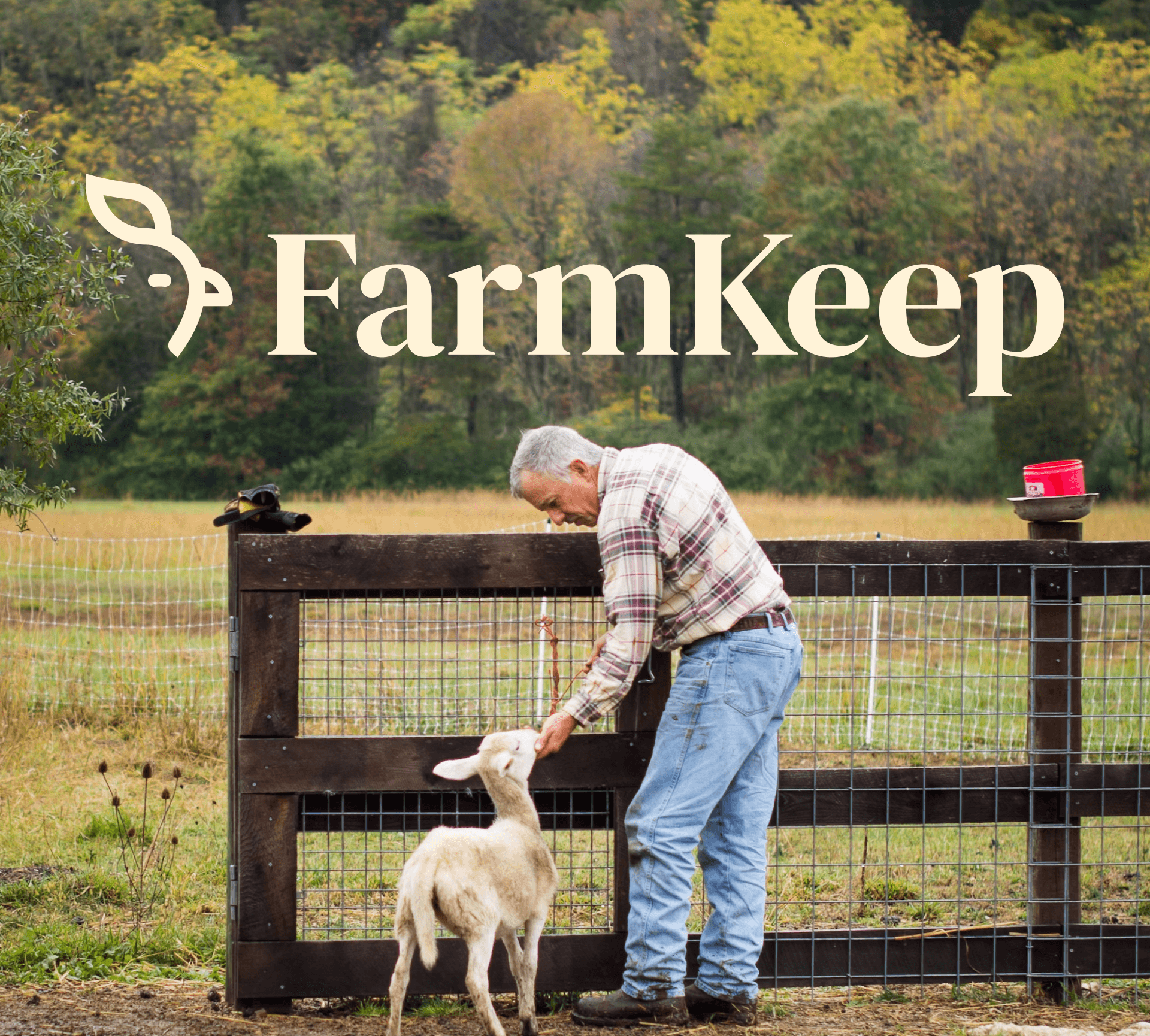
A complete rebrand for an agro-tech platform — designed to feel as grounded and human as the farmers it was built for.

CLIENT

Farmkeep

YEAR

2024

DELIVERABLES

Brand Strategy, Visual Direction, Website Design, Website Development, Marketing Collaterals

ROLE

Creative Direction

The Problem

The tech was there. The soul wasn't.

FarmKeep had built genuinely impressive farm management technology. But their digital presence didn't reflect any of it. The brand felt cold, generic, and disconnected from the people it was meant to serve — farmers who care deeply about their land and their livelihood. The visual language leaned too heavily on tired agricultural clichés, and the result was a product that looked like every other agri-tech tool on the market. The disconnect was beyond aesthetic, it was a trust problem. When your audience works with their hands and lives by their harvests, a brand that doesn't feel real doesn't get a second look.

Project image 01

The Brand Strategy

Designing for the person behind the farm

The rebrand was anchored in the Caregiver archetype — because that's who a farmer actually is. Someone who nurtures, tends, and takes responsibility for something larger than themselves. Every design decision flowed from that foundation. Developed two distinct stylescape directions to explore the visual range — Grounded Technology (structured, reliable, deep greens) and Minimal & Fun (clean, bright, organic shapes). The client chose Minimal & Fun — professional enough to be taken seriously, approachable enough to feel human. Stripped out the clichés — no barn icons, no tractor clip art — replacing them with rich greens, organic forms, and a minimal aesthetic that felt fresh without feeling corporate. The goal: make FarmKeep feel like it was built by someone who understands farming, for someone who does it every day.

The rebrand was anchored in the Caregiver archetype — because that's who a farmer actually is. Someone who nurtures, tends, and takes responsibility for something larger than themselves. Every design decision flowed from that foundation. Developed two distinct stylescape directions to explore the visual range — Grounded Technology (structured, reliable, deep greens) and Minimal & Fun (clean, bright, organic shapes). The client chose Minimal & Fun — professional enough to be taken seriously, approachable enough to feel human. Stripped out the clichés — no barn icons, no tractor clip art — replacing them with rich greens, organic forms, and a minimal aesthetic that felt fresh without feeling corporate. The goal: make FarmKeep feel like it was built by someone who understands farming, for someone who does it every day.

The Execution

Built with care, delivered with clarity

The rebrand was anchored in the Caregiver archetype — because that's who a farmer actually is. Someone who nurtures, tends, and takes responsibility for something larger than themselves. Every design decision flowed from that foundation. Developed two distinct stylescape directions to explore the visual range — Grounded Technology (structured, reliable, deep greens) and Minimal & Fun (clean, bright, organic shapes). The client chose Minimal & Fun — professional enough to be taken seriously, approachable enough to feel human. Stripped out the clichés — no barn icons, no tractor clip art — replacing them with rich greens, organic forms, and a minimal aesthetic that felt fresh without feeling corporate. The goal: make FarmKeep feel like it was built by someone who understands farming, for someone who does it every day.

The rebrand was anchored in the Caregiver archetype — because that's who a farmer actually is. Someone who nurtures, tends, and takes responsibility for something larger than themselves. Every design decision flowed from that foundation. Developed two distinct stylescape directions to explore the visual range — Grounded Technology (structured, reliable, deep greens) and Minimal & Fun (clean, bright, organic shapes). The client chose Minimal & Fun — professional enough to be taken seriously, approachable enough to feel human. Stripped out the clichés — no barn icons, no tractor clip art — replacing them with rich greens, organic forms, and a minimal aesthetic that felt fresh without feeling corporate. The goal: make FarmKeep feel like it was built by someone who understands farming, for someone who does it every day.

The Result

What changed

Before: A technically capable product hidden behind a brand that didn't do it justice. After: A market position built on trust, warmth, and clear visual identity — one that actually earns the attention of the people it's trying to reach. Increased perceived value of the technology through considered design Achieved competitive differentiation from impersonal, overly technical competitors 950+ users experiencing a consistent brand from first visit through daily use.

Before: A technically capable product hidden behind a brand that didn't do it justice. After: A market position built on trust, warmth, and clear visual identity — one that actually earns the attention of the people it's trying to reach. Increased perceived value of the technology through considered design Achieved competitive differentiation from impersonal, overly technical competitors 950+ users experiencing a consistent brand from first visit through daily use.

Create a free website with Framer, the website builder loved by startups, designers and agencies.